Creating a Management Dashboard in Excel – Video Tutorial
Creating a Management Dashboard in Excel : In the field of management, collecting, categorizing, and drawing constructive conclusions from data is always an essential process to better understand project progress. And what better way than Excel to manage data and estimate key performance indicators (KPIs)?
Data is just a set of numbers; you will need a dashboard to access them better. As a consultant or employer, you may need management dashboards to manage multiple projects with multiple executors so that you can monitor the project’s progress in different periods in the form of graphs. You can analyze the data and create a professional management dashboard by hiring a Power BI expert. But if you want to simplify a management dashboard, we recommend using Excel software. This article will teach you how to create a management dashboard, so stay with us.
What is a management dashboard?
A dashboard is one of the best tools for managers to analyze data. A dashboard is a valuable decision-making tool with graphical displays, charts, tables, and other enhanced visual features of key performance indicators. In addition, dashboards provide dynamic charts and widgets to summarize data and display key performance indicators in real time. Dashboards present key business metrics and other complex data in a way that is easy to understand and is the most critical decision-making tool for managers and employees. Although raw numbers and data can be tedious and meaningless, they are essential. That is why that data needs to be put into action and analyzed.
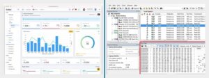
In the image below, you can see the raw data image on the right and the management dashboard image (created based on the raw data) on the left.
You can easily create a professional management dashboard in Excel through Microsoft Excel. Also, for convenience, you can outsource these tasks to experts by hiring an Excel expert and a remote accountant to create the management dashboard and perform accounting tasks based on it.
Management dashboards can be divided into two types:
Static
Dynamic
The difference between static and dynamic management dashboards is that static dashboards highlight data from a specific period and never change. On the other hand, dynamic dashboards are updated daily to keep up with changes.
One way to create a management dashboard is through Excel and its many features. In this blog, we’ll look at the benefits of creating a management dashboard in Excel and how to do it.
What is a Key Performance Indicator?
A KPI, short for Key Performance Indicator, is a measurable performance measure over time for a specific goal. KPIs provide goals and targets for teams to plan towards. They also provide milestones to measure progress and insights that help people across the organization make better decisions. From finance and HR to marketing and sales, KPIs help every part of the business move forward at a strategic level.
Benefits of Creating an Excel Management Dashboard
Cost-effective Data Analysis
Creating a dashboard in Excel is an easy way to transform your raw data into meaningful visual data using simple and understandable graphs and charts. This software is free, and many companies already use it, so it remains to create the management dashboard and categorize the data. This way, an organization can monitor data and reduce costs using Excel.
Flexibility
One of the benefits of creating a management dashboard in Excel is the real-time insight as data is added or changed at any time. The software is very flexible, so you can easily add new products and sometimes monitor only a portion of the data. Similarly, you can customize the dashboard based on what works best for your business and create reports that lead to good decisions. These capabilities help anyone access the level of detail they need to perform their duties within the company and achieve their goals.
Risk Management
Analytical dashboards serve as quick visualization tools to identify trends, which can be very useful for preventing risky situations. Excel management dashboards allow companies to analyze key data quickly and accurately so any warning information can be easily identified.
Understand data at a glance.
Excel management dashboards are a great way to get information from your company. They allow you to immediately track progress by displaying up-to-date information and identifying which strategies are not delivering good results. In addition to having a unified view of data sources, you can segment data and understand the relationship between them.
Effective and targeted results
Just as detailed data analysis through visual charts allows for better decision-making, creating a dashboard in Excel allows for identifying achievable goals for better results. Therefore, a management dashboard identifies potential problems and provides practical solutions.
Increase profits
As we said earlier, a management dashboard shows exactly which part of your company is underperforming and which is improving business performance. Based on this knowledge, you can choose where to focus your time and resources to optimize the organization’s results and how to achieve profits.
Types of Management Dashboards
There are generally four types of management dashboards:
Strategic management dashboard
Focuses on long-term strategies and high-level metrics.
Operational management dashboard
Shows shorter time frames and operational processes.
Analytical management dashboard
Contains large amounts of data created by analysts.
Tactical management dashboard
Used by middle managers of the organization to track performance.
Creating a Management Dashboard in Excel
How to Create a Management Dashboard in Excel
Here is a step-by-step guide on how to create a dashboard in Excel.
Step 1: Enter the Required Data into Excel.
First, enter the data and information into Microsoft Excel (or Google Sheets). If the data already exists in Excel and you are tasked with creating a management dashboard, you have completed the first step. Otherwise, you can transfer the data into Excel in three ways:
Copy and paste the data.
Use an API such as Supermetrics or Open Database Connectivity (ODC)
Use Microsoft Power Query (an Excel add-in).
Hire a Data Entry Specialist
**The choice of any of these solutions depends entirely on your data file type.
Step 2: Organize your workbook.
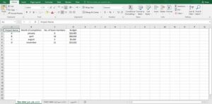
Now that your data is in Excel, creating tabs to organize your workbook is time. Please open a new Excel workbook and add two or more sheets, or tabs, to it. For example, let’s say we create three tabs. Name the first tab “Raw Data,” the second “Chart Data,” and the third “Dashboard.” This will make it easy to compare the data in the Excel file. For example, we’ve collected raw data for four projects: A, B, C, and D. The data includes the time it took to complete the project, the budget for each project, and the number of team members working on each project.
Step 3: Add the raw data to the table.
The raw data sheet you created in your worksheet should be an Excel table, with each data point
recorded in cells. Some people call this step “data cleaning” because it is the step to detect any typos or apparent errors. If you skip data cleaning, you cannot use Excel formulas later.
Step 4: Data Analysis
In this step, we will build a dashboard that suits your needs. First, closely examine the data you have provided and determine exactly what data you want to show on the dashboard. Next, add the data you want to show in the chart data tab. For example, we want to chart the project name, completion month, and budget. So, as shown in the image, I will copy these three columns of Excel data and paste them into the chart data sheet.
Creating a Management Dashboard in Excel
One thing to keep in mind is that you need first to determine the purpose of your management dashboard. In the example above, the purpose is to compare and review the costs of different projects. Knowing the purpose makes the task easier and helps you filter unnecessary data. Analyzing your data also enables you to learn to use the various tools you may want to use in your dashboard.
Some of these tools include:
Charts: To display data in a visual format
Excel formulas: For complex calculations and filtering
Conditional formatting: To automate Excel sheet responses to specific data points
PivotTable: To sort, reorganize, count, group, and summarize data in a table
Power Pivot: To create data models and work with large data sets
Step 5: Determine the visuals.
The most important part of a management dashboard in Excel is its visual features. In this step, we will design the dashboard to represent the data best. In Microsoft Excel, you are given different charts to choose from. For example:
Bar chart: Compares the values in a chart with bars.
Waterfall chart: See how an initial value increases and decreases through a series of changes to reach a final value.
Gauge chart: Displays data in a graduated and needle-shaped chart. Also known as a speedometer chart.
Pie chart: Highlight percentages and proportional data.
Gantt chart: Track project progress.
Dynamic chart: Update a data range automatically.
Pivot chart: Summarize data in a table full of statistics.
Step 6: Create your Excel management dashboard.
By now, you have gathered the needed data and set your goal of creating a management dashboard in Excel. The only thing left to do is to make the dashboard in Excel.
To explain the process of creating a management dashboard in Excel, we will use a clustered column chart. A clustered column chart consists of horizontal, clustered columns that display more than one data series.
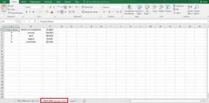
Start by clicking on the dashboard worksheet you created in your workbook.
Then click ‘Insert’> ‘Column’> ‘Clustered column chart.’
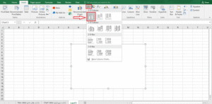
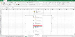
As shown in the image below, right-click on the empty box and click Select data.
Creating a Management Dashboard in Excel
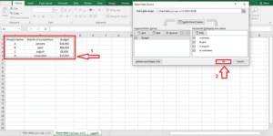
Next, go to the chart data tab and select the data you want to display in your dashboard.
Make sure not to select the column headers when selecting the data.
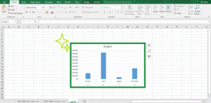
Press Enter, and you have created a column chart dashboard.
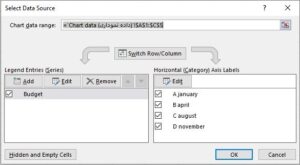
If your horizontal axis doesn’t show what you want, you can edit it. To do so, select the chart again and use the select data option.
The Select Data Source dialog box will appear.
Click Edit under Horizontal (Category) Axis Labels and select the data you want to show on the X-axis again from the Chart Data tab.
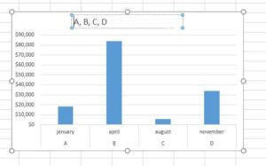
If you want to add a custom title to your chart, select the chart and click Design > Chart Layouts. Choose a chart template that has a title box at the top of the chart. Then click in the box and type the title you want for the chart.
Creating a Management Dashboard in Excel
Step 7: Customize your dashboard.
You can also change the colors, fonts, typography, and layout of the charts to your liking. Additionally, to create an interactive dashboard, go for a dynamic chart. A dynamic chart is a regular Excel chart that, unlike a static chart, automatically updates the data when the data source changes.
You can use Excel features such as:
Macros: Automate repetitive actions (learning Excel VBA can also help here.)
Drop-down lists: Fast and limited access to data entry
Slicers: Let you filter data on a Pivot Table.
Create a simple management dashboard. Of course, management dashboards are highly customizable and vary depending on the type of information and application.
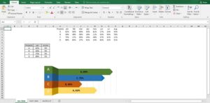
In the image below, you can see another example of a management dashboard.
Dos and Don’ts of Excel Management Dashboard
To create management dashboards in Excel, you need to know the basic needs of the organization and create a management dashboard that answers these two questions:
What is the workflow like?
How do we explain the reason for the increase or decrease in profit to the employer?
Once you have defined the goal, it is essential to determine what metrics you will consider. Focus on metrics directly aligned with the key business goals and evaluate the level of detail appropriate for your audience. This will significantly impact the type of management dashboard you will create.
Make the needs of the organization’s managers your main criteria, not just the data. With this in mind, you will create a useful management dashboard. Try to understand the user domain and create an Excel management dashboard that does not need to be constantly updated. This way, you can reduce development costs.
Don’t overwhelm your audience with too much information. Instead, aim for the dashboard to be useful, informative, and concise. Then, tweak the appearance settings to your liking, filter the data, and display relevant information.
Provide an overview and let users drill down. A well-designed Excel management dashboard should be like a quality newspaper. The first page provides an attractive overview of key information and headlines. However, if someone wants to delve deeper, they should know where to go.
Use the appearance settings and create a clean dashboard. The outlook of charts varies depending on the data type, and there is a lot of variety in making them. This is where visualizing data can come in handy.
Have you ever created a management dashboard in Excel? Let us know what you think.
Creating a Management Dashboard in Excel